
styled components documentation日本語訳②ーAdvancedー
 0
0
概要
styled components documentation日本語訳①ーBasicsーの続き。
前回も述べたが例には動的なものがあるので元ページに行って確認してほしい。
Advanced Usage
テーマの使用
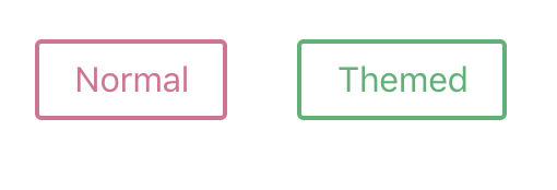
<ThemeProvider>でラップしたcomponentをexportすることでstyled-componentsはthemeの完全なサポートを行っている。
このcomponentはそれ自身の下にある全てのReact componentにcontext APIを用いてthemeを提供する。
何度ネストされていようが、render treeの中でstyled-componentsは受け渡されたthemeにアクセスすることができる。
これを示すためにButton componentを作成してみよう。
ただ今回はいくつかの変数をthemeとしてそれらに受け渡す。
// Define our button, but with the use of props.theme this time
const Button = styled.button\`
  font-size: 1em;
  margin: 1em;
  padding: 0.25em 1em;
  border-radius: 3px;

  /\* Color the border and text with theme.main \*/
  color: ${props => props.theme.main};
  border: 2px solid ${props => props.theme.main};
\`;

// We are passing a default theme for Buttons that arent wrapped in the ThemeProvider
Button.defaultProps = {
  theme: {
    main: "palevioletred"
  }
}

// Define what props.theme will look like
const theme = {
  main: "mediumseagreen"
};

render(
  <div>
    <Button>Normal</Button>

    <ThemeProvider theme={theme}>
      <Button>Themed</Button>
    </ThemeProvider>
  </div>
);
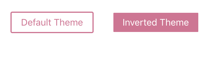
関数を用いたテーマ
theme propにはfunctionを渡すことができる。
functionは親の<ThemeProvider>によって提供されるthemeを引数に取る。
この例では上で作ったテーマ化されたButtonと2つめのThemeProviderによって背景と全面を逆にされたButtonをrenderする。
invertTheme functionは親から渡されるthemeを受け取り新しいthemeを作る。
// Define our button, but with the use of props.theme this time
const Button = styled.button\`
  color: ${props => props.theme.fg};
  border: 2px solid ${props => props.theme.fg};
  background: ${props => props.theme.bg};

  font-size: 1em;
  margin: 1em;
  padding: 0.25em 1em;
  border-radius: 3px;
\`;

// Define our \`fg\` and \`bg\` on the theme
const theme = {
  fg: "palevioletred",
  bg: "white"
};

// This theme swaps \`fg\` and \`bg\`
const invertTheme = ({ fg, bg }) => ({
  fg: bg,
  bg: fg
});

render(
  <ThemeProvider theme={theme}>
    <div>
      <Button>Default Theme</Button>

      <ThemeProvider theme={invertTheme}>
        <Button>Inverted Theme</Button>
      </ThemeProvider>
    </div>
  </ThemeProvider>
);
styled component以外へのテーマの適用
styled componentsの外側(大きなcomponentの中など)でthemeを使う必要があるときはwithTheme HOCを使うことができる。
import { withTheme } from 'styled-components'

class MyComponent extends React.Component {
  render() {
    console.log('Current theme: ', this.props.theme)
    // ...
  }
}

export default withTheme(MyComponent)
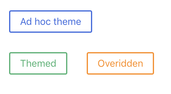
theme prop
theme propを使うことによってもテーマはコンポーネントに渡すことができる。
ThemeProviderがないときや、それを上書きするときに便利である。
// Define our button
const Button = styled.button\`
  font-size: 1em;
  margin: 1em;
  padding: 0.25em 1em;
  border-radius: 3px;

  /\* Color the border and text with theme.main \*/
  color: ${props => props.theme.main};
  border: 2px solid ${props => props.theme.main};
\`;

// Define what main theme will look like
const theme = {
  main: "mediumseagreen"
};

render(
  <div>
    <Button theme={{ main: "royalblue" }}>Ad hoc theme</Button>
    <ThemeProvider theme={theme}>
      <div>
        <Button>Themed</Button>
        <Button theme={{ main: "darkorange" }}>Overidden</Button>
      </div>
    </ThemeProvider>
  </div>
);
Refs
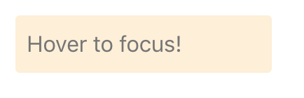
スタイル化する対象に応じて、ref propは以下の2つのうち1つを提供する。
- 基礎となるDOMノード(対象が基本要素の場合 e.g.
styled.div) - React componentインスタンス(対象が
React.Componentの拡張のようなカスタムコンポーネントの場合)
const Input = styled.input\`
  padding: 0.5em;
  margin: 0.5em;
  color: palevioletred;
  background: papayawhip;
  border: none;
  border-radius: 3px;
\`;

class Form extends React.Component {
  constructor(props) {
    super(props);
    this.inputRef = React.createRef();
  }

  render() {
    return (
      <Input
        ref={this.inputRef}
        placeholder="Hover to focus!"
        onMouseEnter={() => {
          this.inputRef.current.focus()
        }}
      />
    );
  }
}

render(
  <Form />
);
注意
古いバージョンのstyled-components(v3以下)かReactを使ってる場合には[innerRefprop](innerRef prop)を使う。
セキュリティ
ご存知の通りstyled-componentsでは任意のインプットをテンプレート構文として埋め込むことができるため、その任意のインプットをセキュリティ的にクリーンにしなければならない。
ユーザのインプットをそのままスタイルとして使用することは、攻撃者が任意のCSSをアプリケーションの中に埋め込む事ができるということだ。
この例は悪意のあるユーザがapiのエンドポイントにリクエストを飛ばすことさえできるということを示している。
// Oh no! The user has given us a bad URL!
const userInput = '/api/withdraw-funds'

const ArbitraryComponent = styled.div\`
  background: url(${userInput});
  /\* More styles here... \*/
\`
※css injectionについてはこことかここを参照してください。
十分な注意が必要だ!
この例がこの場で作ったものであることは明らかだが、CSS injectionはすぐには気づかない悪影響がある。
CSSをJavaScriptから守る標準仕様、CSS.escapeが決まりつつあるが、ブラウザによってはまだサポートされていない。
そのため、polyfill by Mathias Bynensを使うことを推奨する。
既存のCSSとの併用
既存のCSSとstyled-componentsを使用する場合、気をつけなければ行けない点が2,3ある。
styled-componentsはclasses付きの実際のstylesheetを生み出し、className propに基づきstyled-componentsが持つDOM要素にそれらを適用している。
stylesheetの適用はプログラムの実行中、head要素の最後に適用が行われる。
普通のReactコンポーネントのスタイリング
styled(MyComponent)記法を使用し、かつMyComponentが渡されたclassName propをrenderしていない場合なんのスタイルも適用されない。
この問題を解決するためには、コンポーネントが渡されたclassNameをDOM要素に確実に適用することだ。
class MyComponent extends React.Component {
  render() {
    // Attach the passed-in className to the DOM node
    return <div className={this.props.className} />
  }
}

既存のclassによるstyleがある場合、global classと渡されたclassを結合することができる。

class MyComponent extends React.Component {
  render() {
    // Attach the passed-in className to the DOM node
    return <div className={\`some-global-class ${this.props.className}\`} />
  }
}
classが被ったときの問題
styled componentのclassとglobal classを一緒に適用したとき、思いもよらない事が起きるかもしれない。
特定を同じ方法で行ってプロパティを定義したとき、最後にロードされたものが優先される。
// MyComponent.js
const MyComponent = styled.div\`background-color: green;\`;

// my-component.css
.red-bg {
  background-color: red;
}

// For some reason this component still has a green background,
// even though you're trying to override it with the "red-bg" class!
<MyComponent className="red-bg" />

上の例では述べたようにstyled-componentsはhead要素の最後にstyleを適用するため、styled componentのclassが優先される。
そのためただのclassnameセレクタに対してそのstyleが優先される。

解決法の1つはセレクタの選択レベルを上げることである。

/\* my-component.css \*/
.red-bg.red-bg {
  background-color: red;
}
サードパーティ製のスタイルとスクリプトとの衝突の回避
styled-componentsを完全に管理しているわけではないページにデプロイする場合、もとのページとコンポーネントのstyleが衝突しない保証するために注意する必要があるかもしれない。
最もよく起こる問題は特定性が不十分であることである。
例えばもとのページが以下のようなルールを適用している場合を考える。
body.my-body button {
  padding: 24px;
}

このルールはclassnameとタグの名前を2つ含むため、styled componentによって生み出されるclassnameセレクタよりも優先度が高い。

styled.button\`
  padding: 16px;
\`
元のページのstyleから完全に逃れる方法はない。しかし少なくともbabel-plugin-styled-components-css-namespaceでstyled comopnentsのnamespaceを特定し、ルールの強化を行うことができる。
#my-widgetなどのnamespaceを定義すれば、すべてのstyled-componentsはid="my-widget"に設定されたコンテナー内にrenderされる。
なぜならばIDセレクタは何個ものclassnameセレクタより優先度が高いからである。
Media Templates
レスポンシブなwebアプリを開発しているときにはMedia queriesは欠かせない。
単純な例で、境界値である700pxをスクリーンサイズが下回ったときにbackgound colorを変える基本的なcomponentを作ってみる。
const Content = styled.div\`
  background: papayawhip;
  height: 3em;
  width: 3em;

  @media (max-width: 700px) {
    background: palevioletred;
  }
\`;

render(
  <Content />
);

media queriesは長く、アプリケーション中でよく繰り返されるからテンプレートを作ると良い。

関数型言語というJavaScriptの性質上、media queriesの中にstyleを埋め込むためのテンプレートを簡単に定義できる。

const sizes = {
  desktop: 992,
  tablet: 768,
  phone: 576,
}

// Iterate through the sizes and create a media template
const media = Object.keys(sizes).reduce((acc, label) => {
  acc\[label\] = (...args) => css\`
    @media (max-width: ${sizes\[label\] / 16}em) {
      ${css(...args)}
    }
  \`

  return acc
}, {})

const Content = styled.div\`
  height: 3em;
  width: 3em;
  background: papayawhip;

  /\* Now we have our methods on media and can use them instead of raw queries \*/
  ${media.desktop\`background: dodgerblue;\`}
  ${media.tablet\`background: mediumseagreen;\`}
  ${media.phone\`background: palevioletred;\`}
\`;

render(
  <Content />
);
Tagged Template Literals
Tagged Template LiteralsはES6で実装された新機能だ。
stringによるテンプレート構文を定義でき、これを用いてstyled componentが作られている。
補間の表記を書かなかった場合、関数が受け取る第一引数はそれが受け取るstringの配列になる。
// These are equivalent:
fn\`some string here\`
fn(\['some string here'\])

stringの中で補間を行った場合、配列は補間の場所でsplitされたstringを含む。
残りの引数には補間が順番に並ぶ。

const aVar = 'good'

// These are equivalent:
fn\`this is a ${aVar} day\`
fn(\['this is a ', ' day'\], aVar)
少し面倒だが、これによって変数や関数、mixins(css helper)をstyled componentsで受け取り、pure CSSの中で展開することができる。
テンプレート構文についてもっと学びたいなら、Max Stoiberの記事:The magic behind 💅 styled-componentsを読むといい。
サーバーサイドレンダリング(v2+)
styled_componentsはstylesheetのrehydrationを通してリアルタイムなサーバーサイドレンダリングを実装している。
基本的な概念はサーバーでアプリをレンダーするたびにServerStyleSheetを作成し、Reactツリーにプロバイダーを加えることができる。そしてこれはcontext APIによって実現される。
keyframesやcreateGlobalStyleに影響はせず、styled-componentsは様々なReact DOMのSSR APIとともに使用することができる。
ツールを用いたセットアップ
サーバーサイドレンダリングとフロントを協調して動作させるために、babel pluginが必要だろう。
これにより各々のstyled componentに対して天下り的にIDが与えられ、チェックサムのミスマッチが防がれる。
TypeScriptユーザのためにTS専任のOleinikovがTypeScriptを webpack ts-loader / awesome-typescript-loaderにまとめてある。両方とも同じような働きをする。
しかし、もし可能なら最も頻繁にアップデートされているbabel pluginを推奨する。
いまではBabelを用いてTypeScriptをコンパイルできるため、エコシステムの利益を享受するためにTS loaderから切り替え、ピュアなBabel実装をする価値はあるかもしれない。
例
基本的なAPIは以下のよう。
import { renderToString } from 'react-dom/server'
import { ServerStyleSheet } from 'styled-components'

const sheet = new ServerStyleSheet()
const html = renderToString(sheet.collectStyles(<YourApp />))
const styleTags = sheet.getStyleTags() // or sheet.getStyleElement();

`collectStyles`メソッドはプロバイダで要素をラップする。
このメソッドの代わりに、`StyleSheetManager`プロバイダを直接使う方法もある。

import { renderToString } from 'react-dom/server'
import { ServerStyleSheet, StyleSheetManager } from 'styled-components'

const sheet = new ServerStyleSheet()
const html = renderToString(
  <StyleSheetManager sheet={sheet.instance}>
    <YourApp />
  </StyleSheetManager>
)

const styleTags = sheet.getStyleTags() // or sheet.getStyleElement();
sheet.getStyleTag()は複数の<style>タグを複合したstringを返す。
HTMLの出力にCSS stringを追加する場合には考慮しなければならない。
注意
sheet.getStyleTags()とsheet.getStyleElement()は要素がrenderされたあとに呼ばれる。
そのため、sheet.getStyleElement()から得たコンポーネントは<YourApp />と結合してより大きなコンポーネントに組み込むことはできない。
Next.js
もしなければ、基本的にカスタムしたpages/_document.jsを追加する必要がある。
そしてstyled-componentsに対してのロジックをコピーし、<head>にサーバーサイドのstyleを注入する必要がある。
Next.jsレポジトリにある最新の使用例を参照してほしい。
ストリーミングレンダリング
styled-componentsはReactDOMServer.renderToNodeStream()と同時に使用するためのstreaming APIを提供している。
streamingの実装には2パートある。
On the server:
ReactDOMServer.renderToNodeStreamはstyled-componentsがラップした"readable"なストリームを発行する。
HTMLの大部分はストリームに乗るため、任意の付随するstyleがrenderされる準備が整っているなら、styleブロックはReactのHTMLの先頭に追加され、クライアントのブラウザに向かう。
import { renderToNodeStream } from 'react-dom/server'
import styled, { ServerStyleSheet } from 'styled-components'

// if you're using express.js, you'd have access to the response object "res"

// typically you'd want to write some preliminary HTML, since React doesn't handle this
res.write('<html><head><title>Test</title></head><body>')

const Heading = styled.h1\`
  color: red;
\`

const sheet = new ServerStyleSheet()
const jsx = sheet.collectStyles(<Heading>Hello SSR!</Heading>)
const stream = sheet.interleaveWithNodeStream(renderToNodeStream(jsx))

// you'd then pipe the stream into the response object until it's done
stream.pipe(
  res,
  { end: false }
)

// and finalize the response with closing HTML
stream.on('end', () => res.end('</body></html>'))
On the client:
import { hydrate } from 'react-dom'

hydrate()
// your client-side react implementation
クライアントサイドのrehydrationが完了したあと、普段どおりstyled-componentsは引き継がれ、ストリーミングのものと入れ替わったあと、任意の動的なスタイルが適用される。
他のコンポーネントの参照
コンポーネントに対してその場その場でstyleをオーバーライドする方法はたくさんある。とはいっても、CSSセレクタのパラダイムを使用せずにこの目的を達成することは多くの場合難しい。
styled-componentsはこの点において、"component selector"パターンによってキレイな実装を可能にする。
コンポーネントが作成、もしくはstyled()ファクトリー関数でラップされたとき、そのコンポーネントは同時にターゲッティングのためのCSS classが付与される。
これは名前付けについてあれこれ考えずにすみ、セレクタの衝突を回避できる非常に強力な構成パターンである。
以下の実践的な例では、Iconが親のLinkがマウスオーバーされたときのレスポンスを定義している。
const Link = styled.a\`
  display: flex;
  align-items: center;
  padding: 5px 10px;
  background: papayawhip;
  color: palevioletred;
\`;

const Icon = styled.svg\`
  flex: none;
  transition: fill 0.25s;
  width: 48px;
  height: 48px;

  ${Link}:hover & {
    fill: rebeccapurple;
  }
\`;

const Label = styled.span\`
  display: flex;
  align-items: center;
  line-height: 1.2;

  &::before {
    content: '◀';
    margin: 0 10px;
  }
\`;

render(
  <Link href="#">
    <Icon viewBox="0 0 20 20">
      <path d="M10 15h8c1 0 2-1 2-2V3c0-1-1-2-2-2H2C1 1 0 2 0 3v10c0 1 1 2 2 2h4v4l4-4zM5 7h2v2H5V7zm4 0h2v2H9V7zm4 0h2v2h-2V7z"/>
    </Icon>
    <Label>Hovering my parent changes my style!</Label>
  </Link>
);
Linkコンポーネントの中でネストさせた色の変更ルールを定義することがができるが、なぜIconがそうなるのかを理解するために親と子両方のルールを考慮する必要があるだろう。
注意
上記のような振る舞いはStyled Components同士でのみサポートされる。
以下の例でBを実装しようとすると失敗する。
なぜならコンポーネントAはStyled ComponentではなくReact.Conponentのインスタンスだからだ。
class A extends React.Component {
  render() {
    return <div />
  }
}

const B = styled.div\`
  ${A} {
  }
\`
styled componentはコンポーネントをテンプレート構文の補間のための関数として呼ぼうとするため、Cannot call a class asという例外が発生する。
しかし、Aをstyled()でラップすることでテンプレート構文内で使用可能になる。
ラップされたコンポーネントがclassNameを渡してくれることが確かになるからだ。
class A extends React.Component {
  render() {
    return <div className={this.props.className} />
  }
}

const StyledA = styled(A)\`\`

const B = styled.div\`
  ${StyledA} {
  }
\`
Style Objects
styled_componentsはCSSをstringではなく、JavaScriptオブジェクトとして書くこともサポートしている。
これは特に、すでにstyleオブジェクトを持っており、徐々にstyled_componentsに移行したいときに有用である。
// Static object
const Box = styled.div({
  background: 'palevioletred',
  height: '50px',
  width: '50px'
});

// Adapting based on props
const PropsBox = styled.div(props => ({
  background: props.background,
  height: '50px',
  width: '50px'
}));

render(
  <div>
    <Box />
    <PropsBox background="blue" />
  </div>
);


